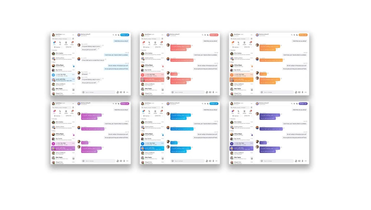
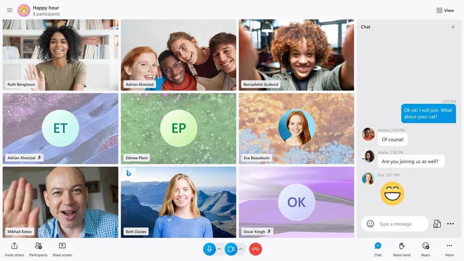
Microsoft is adding new themes and layouts, offering some much-needed customization to the main calling interface in Skype. IT will now give you plenty of options. You will be able to choose between speaker view, grid view, large gallery, Together Mode, and even a content view.
Skype is Getting a Redesign Again with New Themes and Features
Skype’s new colourful themes will soon be available, with button gradients, an improved side panel on mobile, and Fluent Design icons throughout the apps. Skype users without avatars will also get colourful gradients to make it easier to let chats apart.
The most important part of Skype is getting the most attention. The grid that’s displayed during calls will soon include everyone on a call, regardless of whether they have enabled video or not. This puts all participants side by side, including your own video in the main interface.
Microsoft also claimed that it is increasing performance on the Android version by more than 2,000 per cent in “key scenarios” and 30 per cent on desktop versions of Skype. Microsoft is also making a commitment to support all browsers with its future Skype changes. Some of these improvements are live now, while others will roll out in the coming months. Currently, users will get the custom notification sounds. Whereas, a new TwinCam feature that lets you add your phone camera will join later. The new redesign looks amazing and will help to attract more users to use the app for making video calls.

